Glistening waves flicker across the screen, rhythmic drumming resounds off-screen, followed by a catchy piano melody. Cut. A man’s sporty silhouette stands before the sunset on the beach, then enters the striking voice of the rock star Jimi Jamison: “Some people stand in the darkness…”, and across the screen in large coloured letters runs the title: BAYWATCH. I stare at the screen and am stunned. Suddenly I’m 13 again, lounging about with friends on the home sofa with no greater worries than whether Mitch and Stephanie will finally make it together.
It’s exactly this strange nostalgic wave that bursts over one when observing the pictures of well-trained lifeguards and romantic sunsets that fascinates the Danish artist Søren Hüttel. In his current exhibition “A little bit of soap” at Galerie Kuchling, he examines and articulates the visual language of American TV series, sitcoms and soap operas from the 80s and 90s through installations, sculptures, paintings and light objects, which have imprinted themselves as part of western pop culture on the visual memory of multiple generations
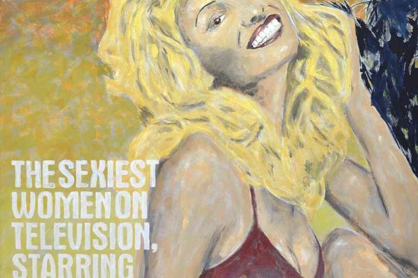
Born in 1976, Hüttel grew up with Baywatch, Dynasty, ALF and Cheers: “Alf and Dynasty are from my early childhood, where Pamela Anderson and Baywatch are from my early adulthood… They all refer back to ‘old’ times when flow TV[1] was part of my – or part of my generation’s – upbringing. And now these images have a completely different story to tell – that of nostalgia.” But why do these film formats seem so cosy to us now, and how exactly do the images of TV series carry such a bittersweet yearning for the past? On the one hand, classic soap operas and sitcoms are based on the principle of reliability: the figures of Dynasty will always be rich, beautiful and entangled, ALF will always be, in the next episode, the beloved mischief-maker, who at the end reconciles the family in the living room. The structure of a series itself is relatively predicable, and whilst it may surprise us with dramatic twists, its characters and their environments remain consistent and thus provide structural security. On the other hand, these formats use a language of their own, imprinting themselves on our visual memory by their specific, characteristic repetition. All this, linked to our own, sweetened memories of the time when we first saw the images on the almost now forgotten tube TV, is the perfect mixture for the nostalgic cocktail. And Søren Hüttel knows exactly how to mix this cocktail. With an unmistakable feeling for the semiotics of imagery, colours and phrases, he carries the fragments of a familiar and, as it were, over-drawn world into the exhibition space with subtle humour and sensitivity. In doing so, he does not shy away from using different materials such as marble, wood, paper, canvas or the artificially-cool surfaces of a neon advertisement. The effect is astonishing. There lies Pamela Anderson’s unforgettably erotic swimsuit, its smooth and precise surface of white-grey Carrara marble suddenly revealing the normally bright-red piece of Lycra for what it is: a fetish object, even without the body of its blond protagonist; a pop-culture sign, readable without its context.


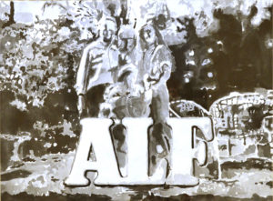
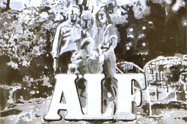
Hüttel’s large-format watercolours, in which the artist combines logos and characters with pictorial representations, demonstrate just how strongly these cultural symbols influence the context in which they appear. Thus in “ALF” (2017), the familiar logo of the sitcom immediately catches the eye and one deciphers the blurry watercolour as a family portrait of the Tanners. The reading of “Soap” (2016), on the other hand, is different: here the drawing of a large group portrait before an opulent background is the key to the word “soap”. It quickly becomes clear that it’s about the handsome actors of the soap opera and not about the promotion of a piece of soap that those portrayed might use. Even more impressive is the drawing “Dynasty” (2017), the simple but effective combination of picture and lettering working together as pop-culture fragments. Hüttel holds a still image from the intro of the soap opera of the same name, upon which runs the series title in striking, yellow type over the roof of the Carrington family house. Or so recognises the viewer familiar with the soap. Someone who does not know the series sees only the word “Dynasty”, visibly and literally bloated upon the stately home; one can at least detract that it’s about the interlacing of property and family relations.
The image and language symbols used by Hüttel are thus influenced by their original context, but at the same time remain open to further interpretations – especially when they appear in the exhibition space, which itself is already charged with meaning (there must be art in here!). This makes them both attractive and provocative, such as with Hüttel’s neon light: “Ha! I kill me!” (2017). The unknowing observer finds oneself unsettled by the bright neon letters and is not quite sure whether a joke such as “Ha! I kill me!” is actually a serious declaration, one that’s unfortunately all too fitting for today. Yet every ALF expert immediately understands that this is the cult phrase of the extra-terrestrial from the planet of Melmac. Hüttel is deliberately challenging these irritations, which often hinder the rational interpretation of his works of art: “Eclecticism is a method I use to make my artworks so the works are not readily understandable, or understandable at all, perhaps due to the clashes of themes and form. It’s all up to the viewer… I know it’s sometimes very annoying and frustrating not to know what the hell it’s about. [And] whether it’s about anything else than being an art object after all. And that’s tough as hell.”
As well as their relation to the exhibition space, Hüttel’s works focus on the nature of art, particularly because the artist picks them out of their (mass) media and stylistic appearance: a film scene becomes a blurred watercolour, the idiomatic expression of the striking, space-defining neon light. The importance of this media change is particularly evident in Hüttel’s “They’re Back” series (2017).

Here, the artist transcribes various title sheets of the American television magazine “TV Guide” into strong colours on small-format canvases. In doing so, he alters only a few details of the respective original, such as the shirt colour of the person or the colour of the logo. And yet we see at these title-page paintings differently from their originals. For as paintings on the canvas, they reveal what the mass-printed titles really are: classical portraits. Only now do Hüttel’s fleeting brush strokes let us see what we barely perceive with the omnipresence of VIP photos and loud, screaming fonts in print and online media. And this slight critique, through his use of the classical medium of painting, also suggests something nostalgic. It’s no coincidence that all “TV Guide” pictures are comebacks of shows and stars of the past decades.
It seems as if an entire generation longs for the good old (TV) time – and Hüttel senses this longing in his works: “I like to work with images that reek of nostalgia and also sentimentality. What I find interesting is that so many artists of my generation – both Danish and international – are working with nostalgia… I think it is a contemporary condition. It somehow makes some artworks talk to certain generations. My nostalgia is perhaps not your nostalgia, and my nostalgia is certainly not my parents’ nostalgia. That’s probably why some people find my works completely incomprehensible… where others, well hopefully, know the codes and understand the subtext of the works on a sentimental level. I find this mapping of a sentimental territory interesting as it also suggests some sort of cultural belonging.” This staking of a backward-looking sentiment is never a melancholic or even cumbersome passage for Søren Hüttel. On the contrary: with ease, wit and the unbridled cheerfulness of neon pink, he takes the viewer on a reliquary journey through our not too distant pop-culture past and playfully presents the powerful language of mass culture, which only in the abstraction of a work of art combines its entire nostalgic power.
[1] The ‘flow’ of a TV programme ensures that transitions between individual programme sequences are no longer precisely separated but instead are increasingly blurred. The result: one series follows the next and commercials, adapted to each series, flow with the programme.
Text: Claudia Heidebluth, Translation: William Russell


